When Apple announced its major design overhaul, Liquid Glass, at last year’s WWDC, it was met with a polarizing reaction from users. While some users liked the sleek, transparent designs that look “glassy,” others found the new design difficult to read. At Apple’s WWDC 2026 event on Monday, the company announced some changes that may benefit the Liquid Glass haters among us.
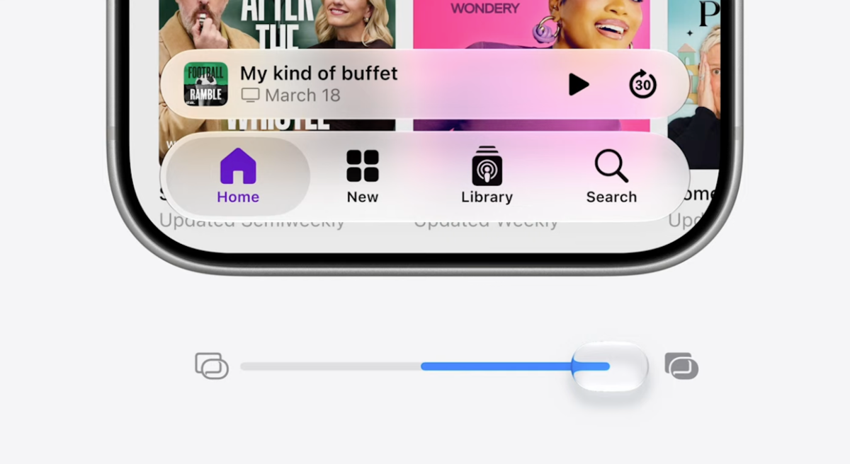
Apple says that it is “updating the foundations of how Liquid Glass is built to ensure exceptional readability.” It will apparently accomplish this by diffusing “complex content” behind it to create more depth and separation between content panels.
Crucially, Apple said that it won’t force users into this new look.
“Since everyone’s preference varies, we’re adding a new slider and settings to adjust Liquid Glass, so you can set it anywhere from ultra clear to fully tinted,” the company said.
On both iOS and MacOS, Apple will also redesign its app icons to look more refined and cohesive, which could help pull the Liquid Glass look together. Developers will be glad to know that Liquid Glass customizations will work within their apps at launch.
This is evidently important enough to Apple that the company kicked off WWDC with this assurance that Liquid Glass will get better.
“Like with all major design updates, there is a natural process where we take a bold leap forward, and then we continue to iterate,” Apple said in its presentation. “Our team really appreciates your feedback, and we considered it deeply as we refined the new design over the past year.”
Source: https://techcrunch.com/2026/06/08/apple-is-tweaking-its-controversial-liquid-glass-design/